Reserve, Drop & Fly
RESERVE, DROP & FLY
Redesigned Alaska Airline's pre-boarding service to make traveling with a carry-on bag more convenient for customers
/Service design + Experience design
/Service design + Experience design
TIMELINE
5 weeks
ROLES
Service Designer
User Researcher
Prototyper
ADVISOR
Jacob Wobbrock
TEAM
5 Designers
OVERVIEW
Over the course of 5 weeks, the team found that overhead bin availability and security stress passengers traveling with carry-on luggage, so we designed an overhead bin reservation system and a free early drop-off service to simplify airport waiting and pre-boarding.
MY ROLE
As the UX designer, I planned and conducted user research, including field observations and interviews, to understand the problem space. I also ideated, created experience prototypes, moderated user testing sessions, and iterated designs based on feedback, resulting in the creation of a video prototype to demonstrate the ideal experience.
DESIGN
Features
Customer journey Map
Overall, our service touches on 4 different touch-points on a customer journey map.
Customer journey Map
Overall, our service touches on 4 different touch-points on a customer journey map.
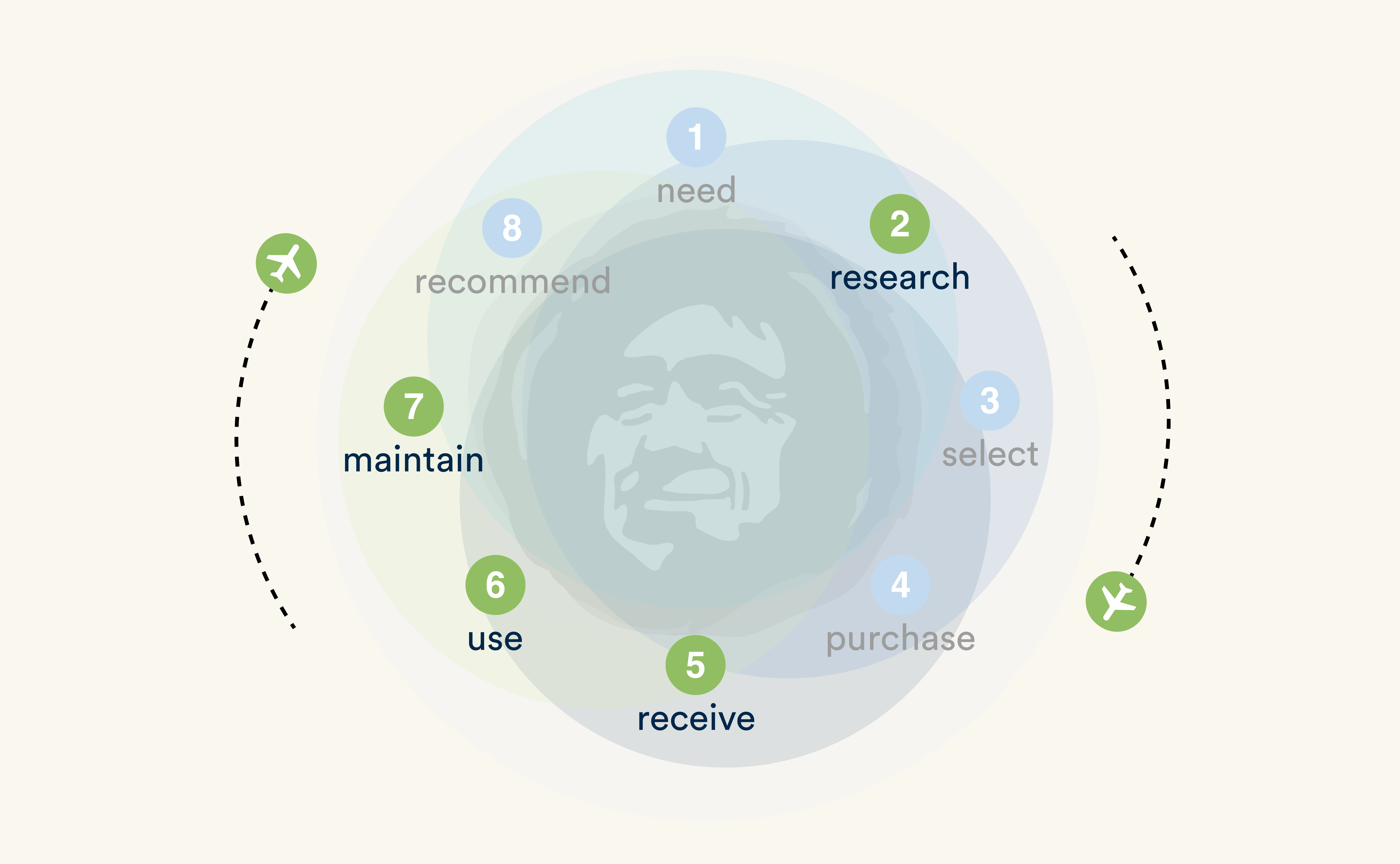
(Research) improve awareness
We designed a hover interaction with Google Flight’s current system to raise the awareness.
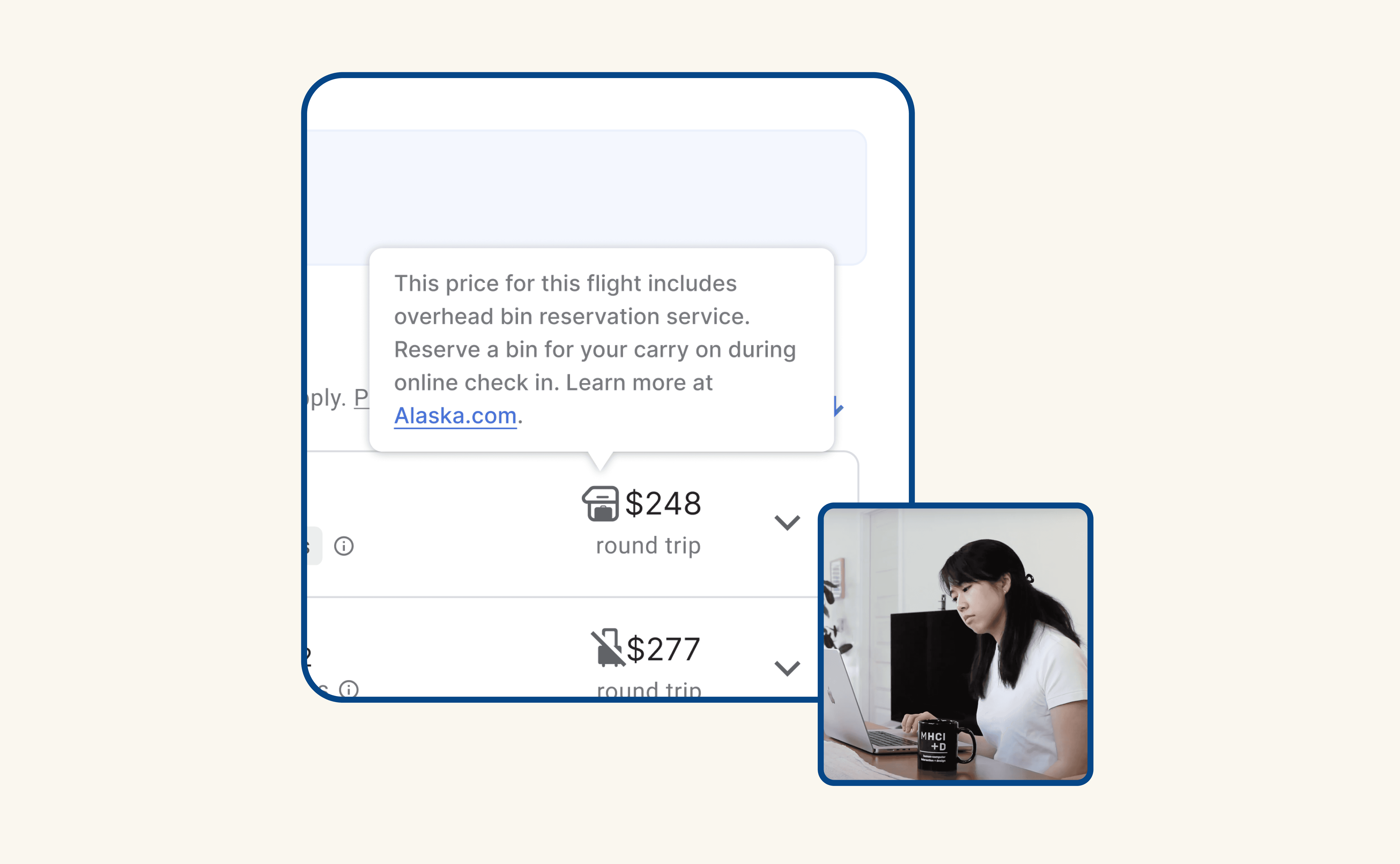
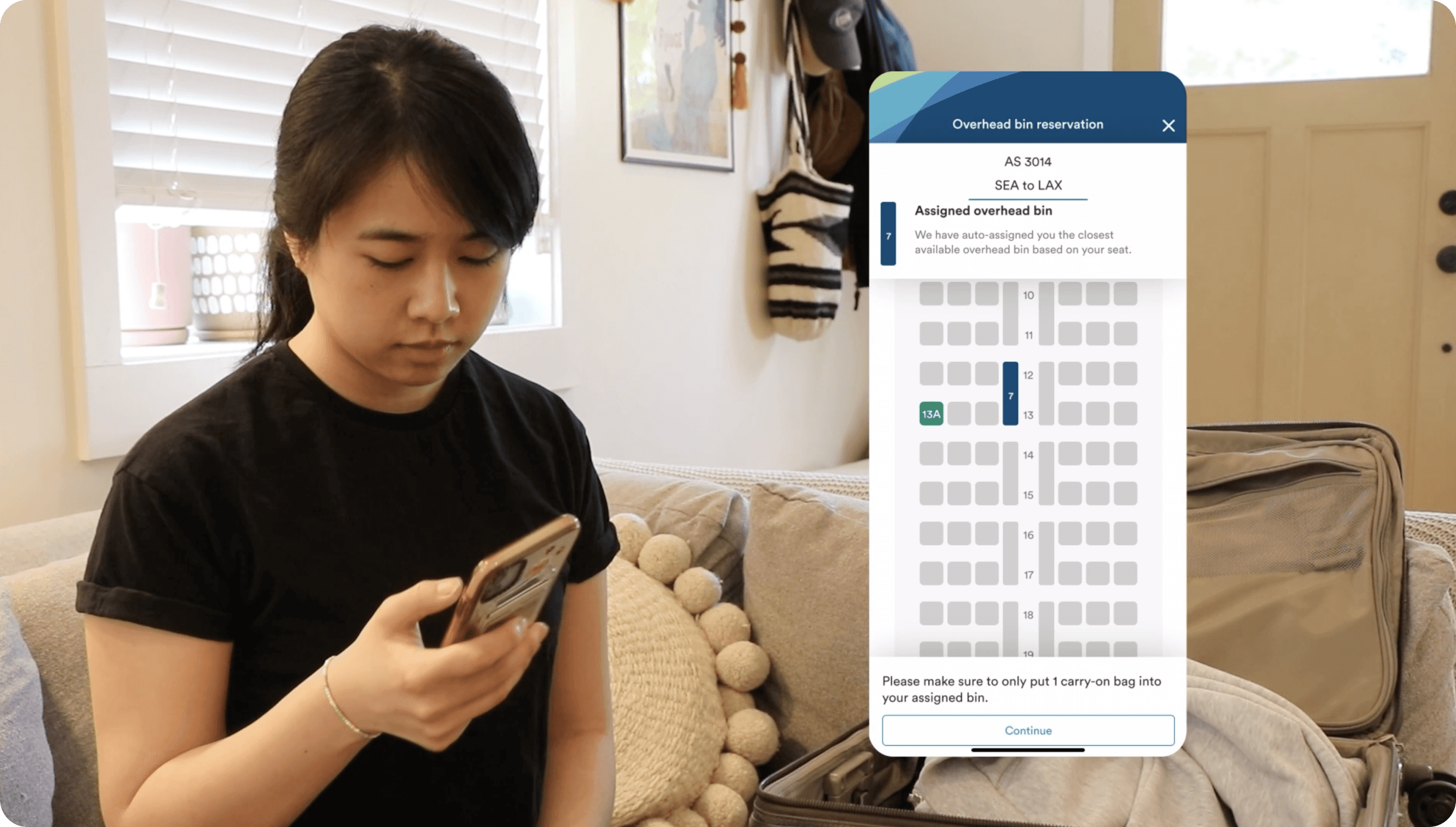
(Receive) pre-reserve overhead bin
Following seat selection, passengers are assigned to the nearest overhead bin. Whether passengers received a spot or not, this feature provides customers with an additional level of certainty for their carry-on.
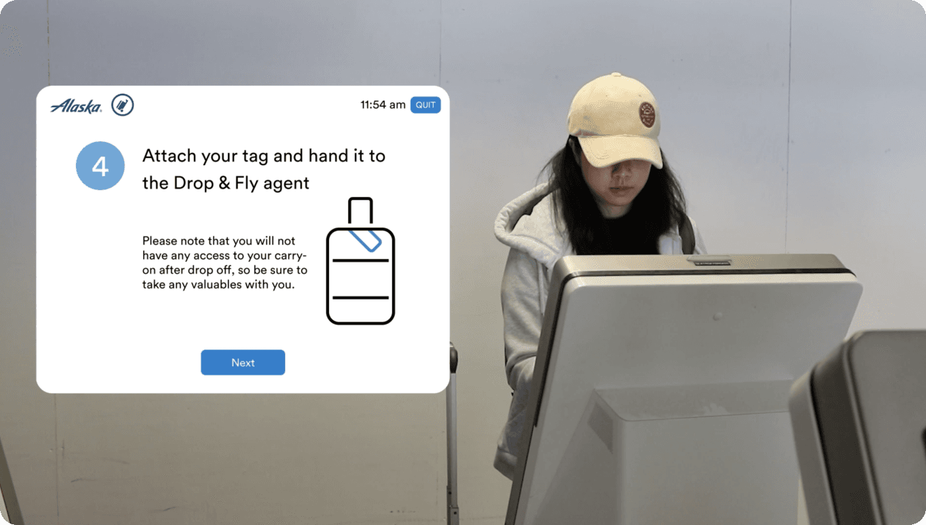
(Use) Free drop & Fly service
Drop & Fly is a free baggage handling service evokes a hotel concierge atmosphere, and makes economy passengers feel like they are being treated with premium level service.
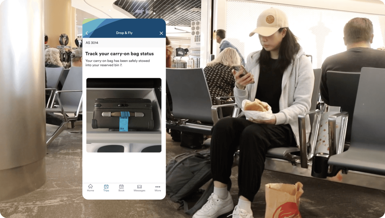
(Use) keep passengers informed
Once passengers have dropped off their carry-on, we will send them notifications about their drop-off status to keep them informed and give them a sense of certainty while they wait at the airport.
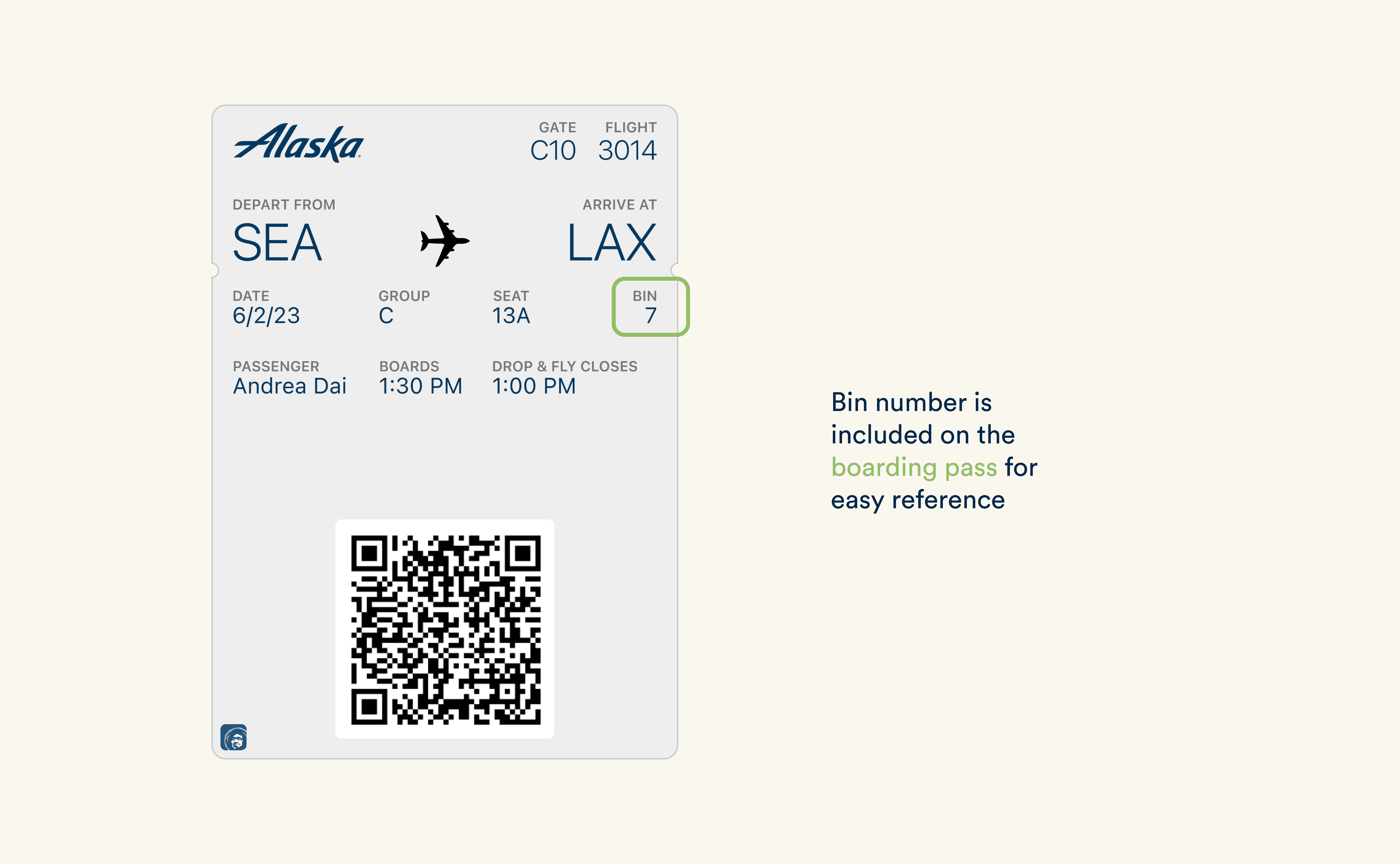
(Use) quick access to bin number
Since our user testing showed that passengers use their boarding pass to track their flight and seating information, we added their overhead bin number to the digital boarding pass for easy access.
(Use) Themed overhead bin lights
We incorporated the aurora lights (associated with Alaska) to show passengers if an overhead bin is not full and still has availability.

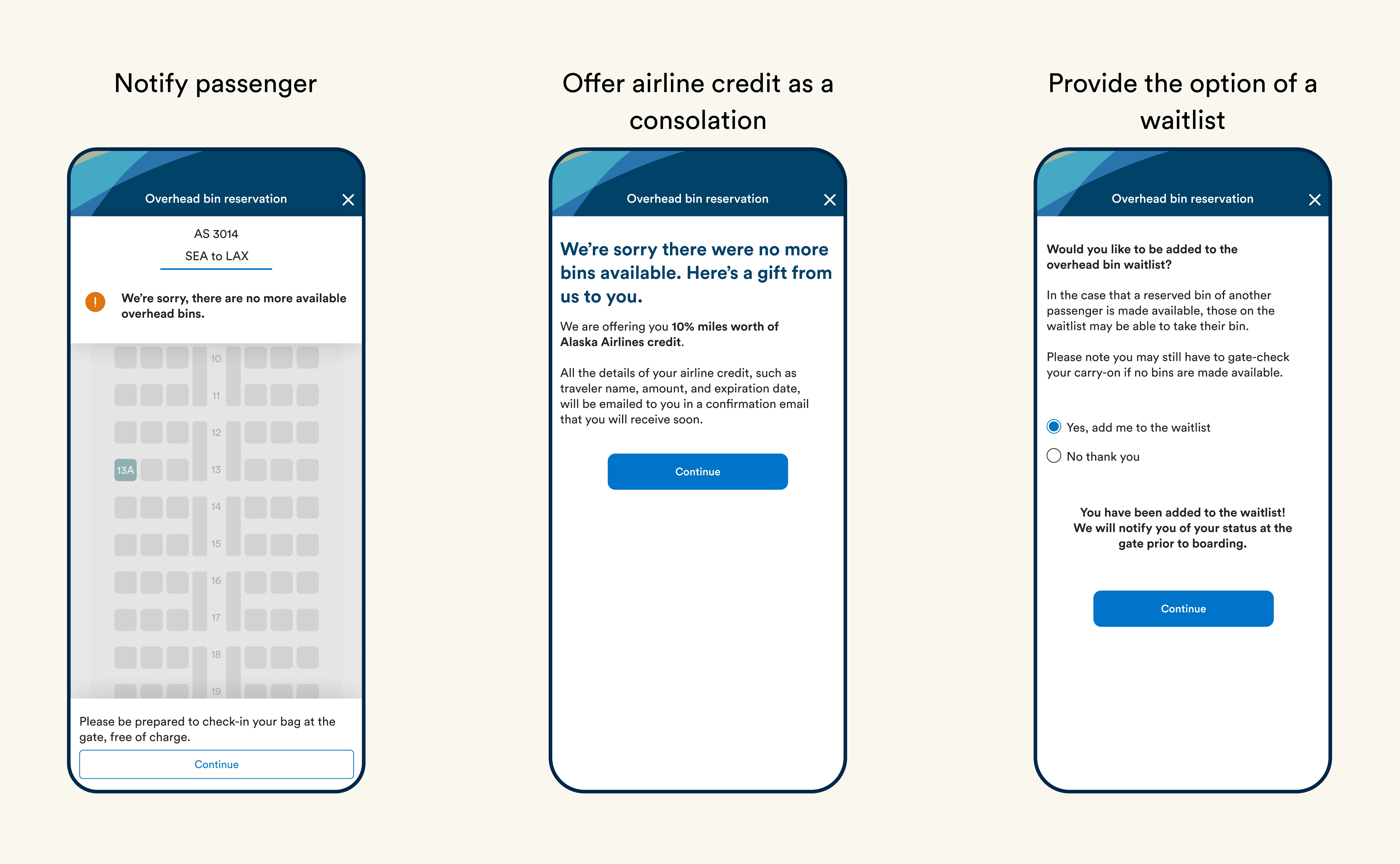
(Maintain) Consider edge cases to improve customer loyalty
In case passengers couldn't get a reserved bin, they are offered airline credit and the option to join a waitlist
Please look on a tablet or desktop for the most optimal user experience!
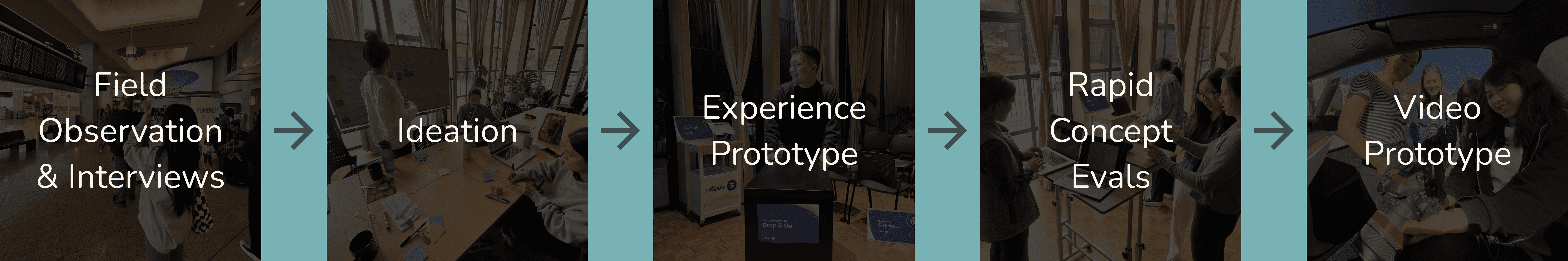
OVERALL DESIGN PROCESS
A design process centered on experiences
BACKGROUND
A service design project addressing airport travel challenges for travelers
For this service design class, my team and I wanted to understand how customers perceive current airport experiences and identify design opportunities to address any challenges they face
PROBLEM SETTING
Focus on pre-boarding touchpoints based on our personal experiences
To investigate the problem space, our team identified and discussed the challenges we faced as a group at various airport touchpoints, recognizing the overwhelming nature of crowded conditions and information overload during wait times. As a result, we decided to focus on the pre-boarding touchpoint at SeaTac airport.
Various touchpoints and challenges we identified
HYPOTHESIS
Airport waiting presents shared challenges for everyone
Based on our assumptions, we believed the difficulties we encountered while waiting at the airport were likely shared by others. We also assumed that current airport experiences were overwhelming for customers, contributing to a negative and anxious travel experiences.
FIELD OBSERVATION & INTERVIEWS
Observe pre-boarding experience and understand people's perception in context
We conducted a field observation at SeaTac airport and interviewed 8 passengers in the waiting area to identify potential waiting challenges. I was responsible for organizing the study plan, moderating interviews, taking field notes, and synthesizing data with the team.
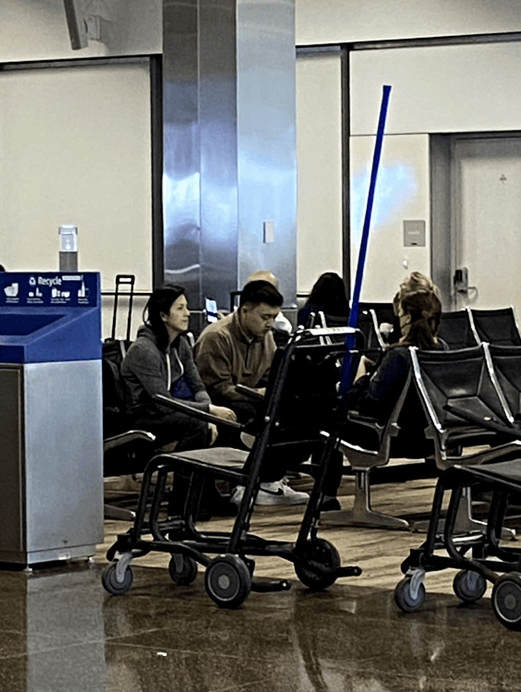
My teammate and I interviewed people in the waiting area about their pre-boarding experience
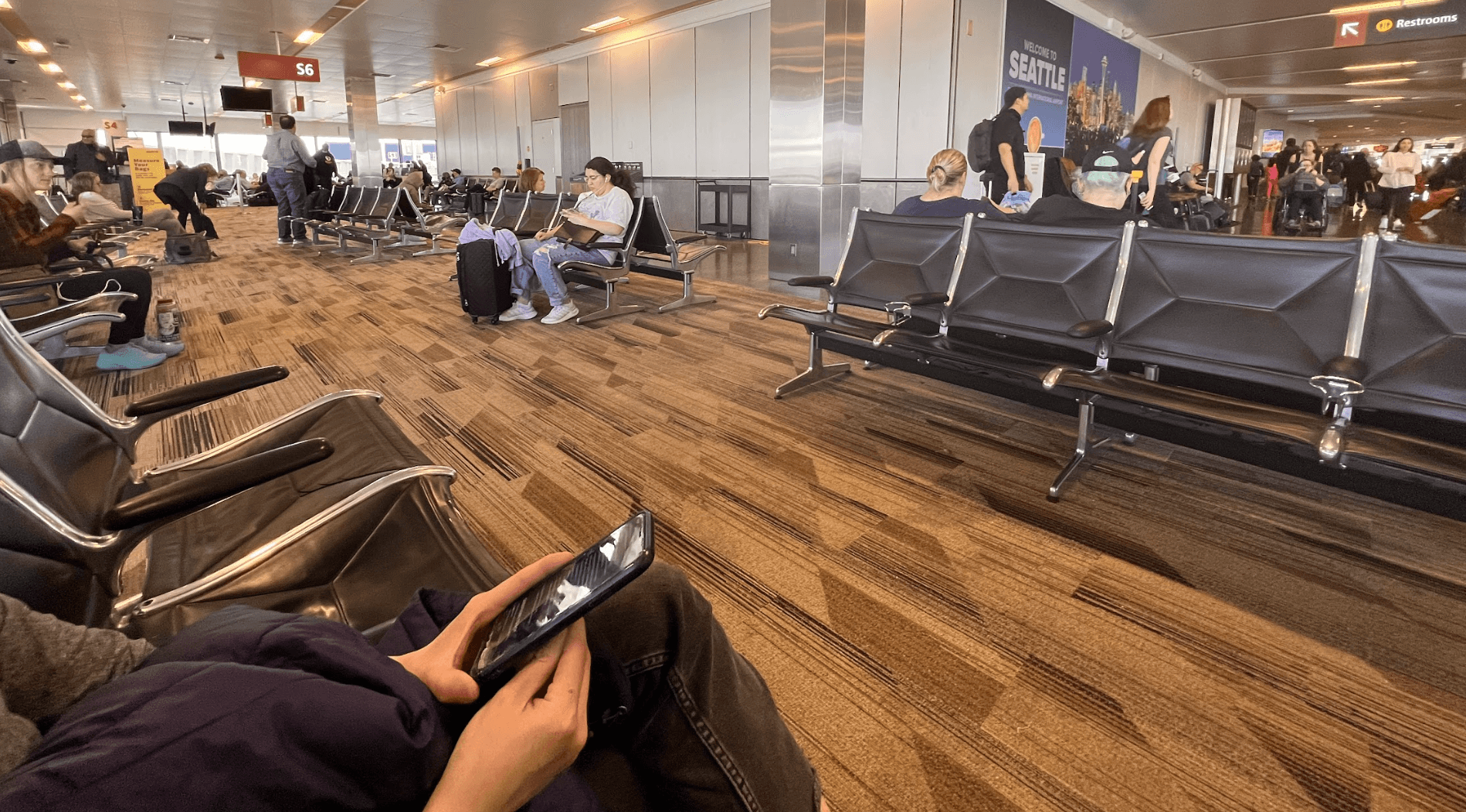
My teammate and I sat near a gate and took notes on our phones about people's behaviors
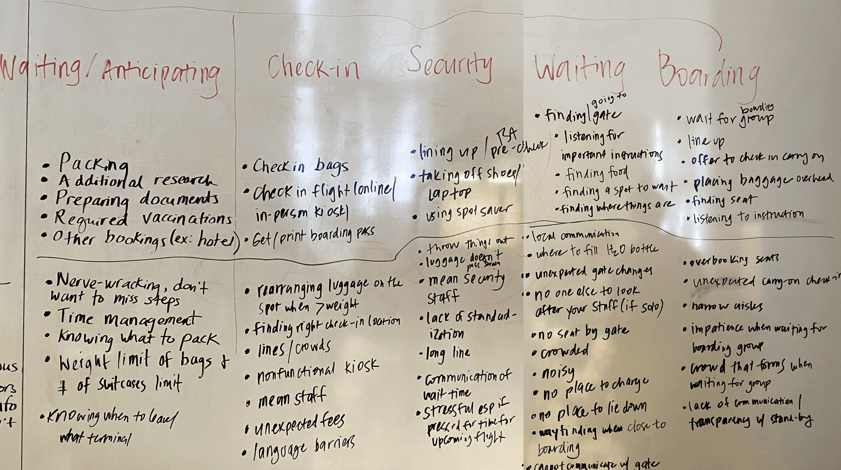
FINDINGS
Carrying a carry-on can be burdensome during airport waiting
People behave differently when they have a carry-on. For example, some passengers may want to board the plane earlier to secure an overhead bin, and they need to pay closer attention to announcements if the plane is full.
We synthesized our data and identified themes and findings (black stickies)
Some passengers bring multiple bags with them when they wait at the airport
Some passengers like to line up early before the boarding announcement
People want certainty and immediate access to information
People didn’t like the disordered pre-boarding process, especially lines and unexpected changes
Design Challenge
How might we improve the airport experience in order to provide certainty and prevent potential inconveniences for passengers during the pre-boarding process?
IDEATION
Draft stories to help us brainstorm and narrow-down our ideas
Overall, the team brainstormed 40+ ideas and used stories to help us down-select. During this process, I ideated 10 ideas, created wireframes, discussed with my teammates to come up with design principles, drafted 2 user stories, and down-selected.
Story Drafting Phase - We used different colored stickies to take notes on the aspects we liked or disliked from each other's stories.
DOWN-SELECTING
Focus on a carry-on reservation system with a complementary drop off service
After narrowing down the options, the team prioritized the carry-on reservation concept with a complementary drop-off service, allowing passengers to drop off their bags early at the gate and let staff pre-load bags to speed up boarding.
I sketched key scenarios to show our envisioned design
CUSTOMER JOURNEY MAP
Understand customer's experience and identify critical touchpoints
To better communicate customer experience, our design team created a customer journey map and identified 4 touchpoints that form the foundation of our envisioned user experience.
The four important touchpoints we identified in our customer journey map
USER FLOW DIAGRAM
Consider extreme cases when mapping out the steps and interactions
To visualize the sequential steps and interactions in our design, the team created a user flow diagram. This exercise inspired me to explore extreme cases and work with my teammates to incorporate features that address these scenarios.
The user flow diagram we created to visualize the structure of our design
COMPETITOR ANALYSIS
What strategies do other airlines use for carry-on?
The team conducted competitor analysis to understand the existing solutions from different airlines and discovered that not many airlines provide services to address carry-on.

We conducted competitor analysis with these airlines
LEAN CANVAS
Identify the business benefits and sources of revenue
The team created a lean canvas to identify how our design is better than our competitors, and we learned that our service could use increased ticket sales for under-booked flights to generate revenues for the company.
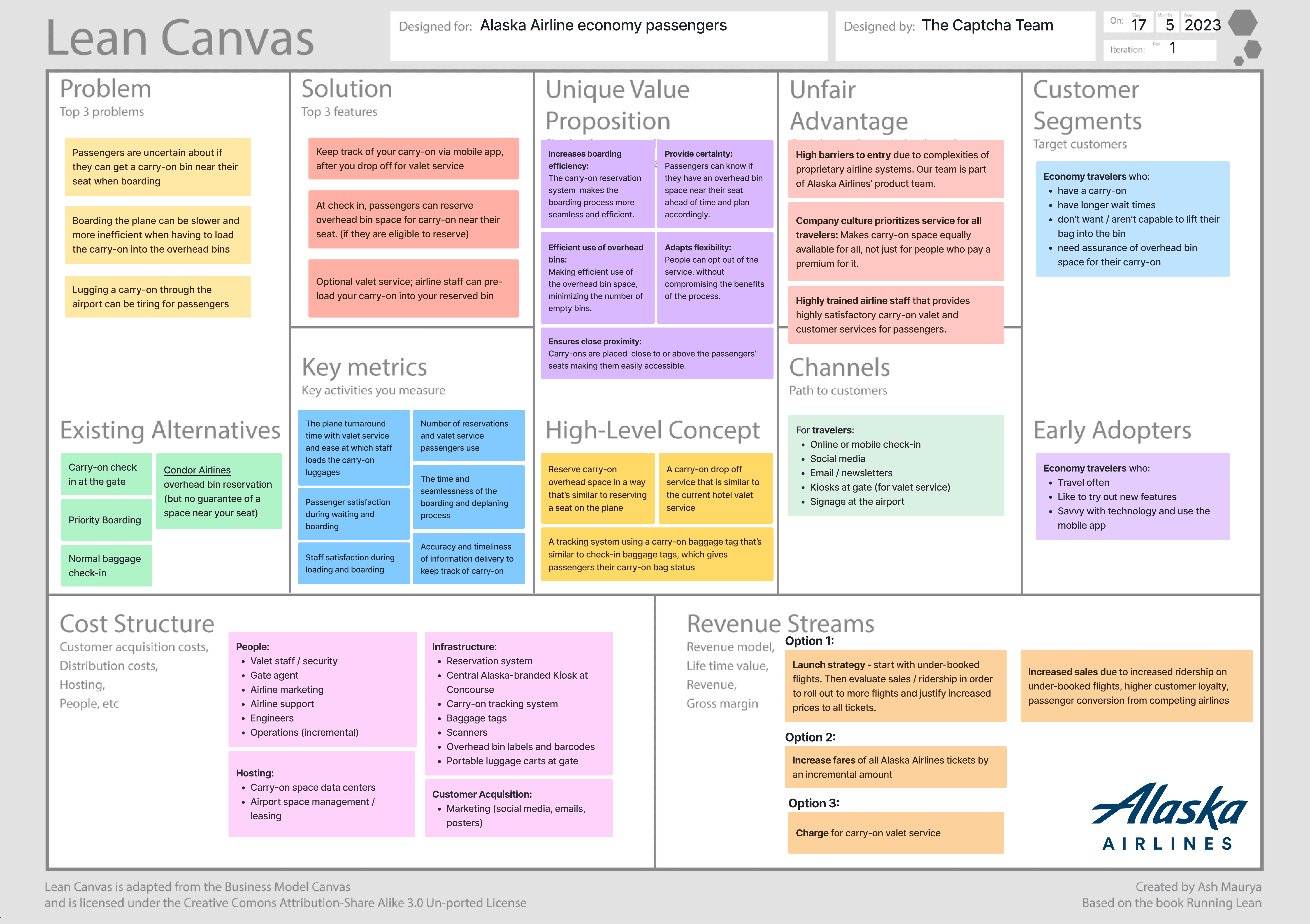
The lean canvas we created to recognize our advantages and revenue streams
EXPERIENCE PROTOTYPE
Evaluate design in an airport-like environment for immersive experience
The team built an experience prototype in an airport-like setting for immersive testing and feedback. My responsibilities included planning the prototype building process, designing visuals, envisioning the information experience, creating realistic signage, and constructing a space that mirrored an airport waiting area.
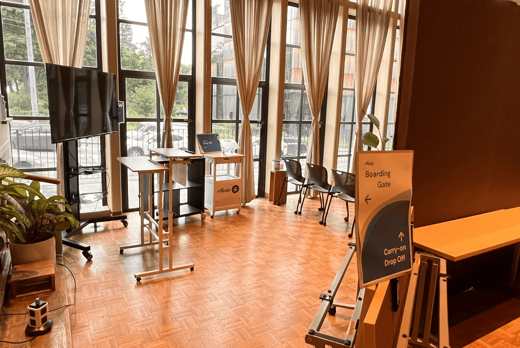
Our airport waiting area prototype
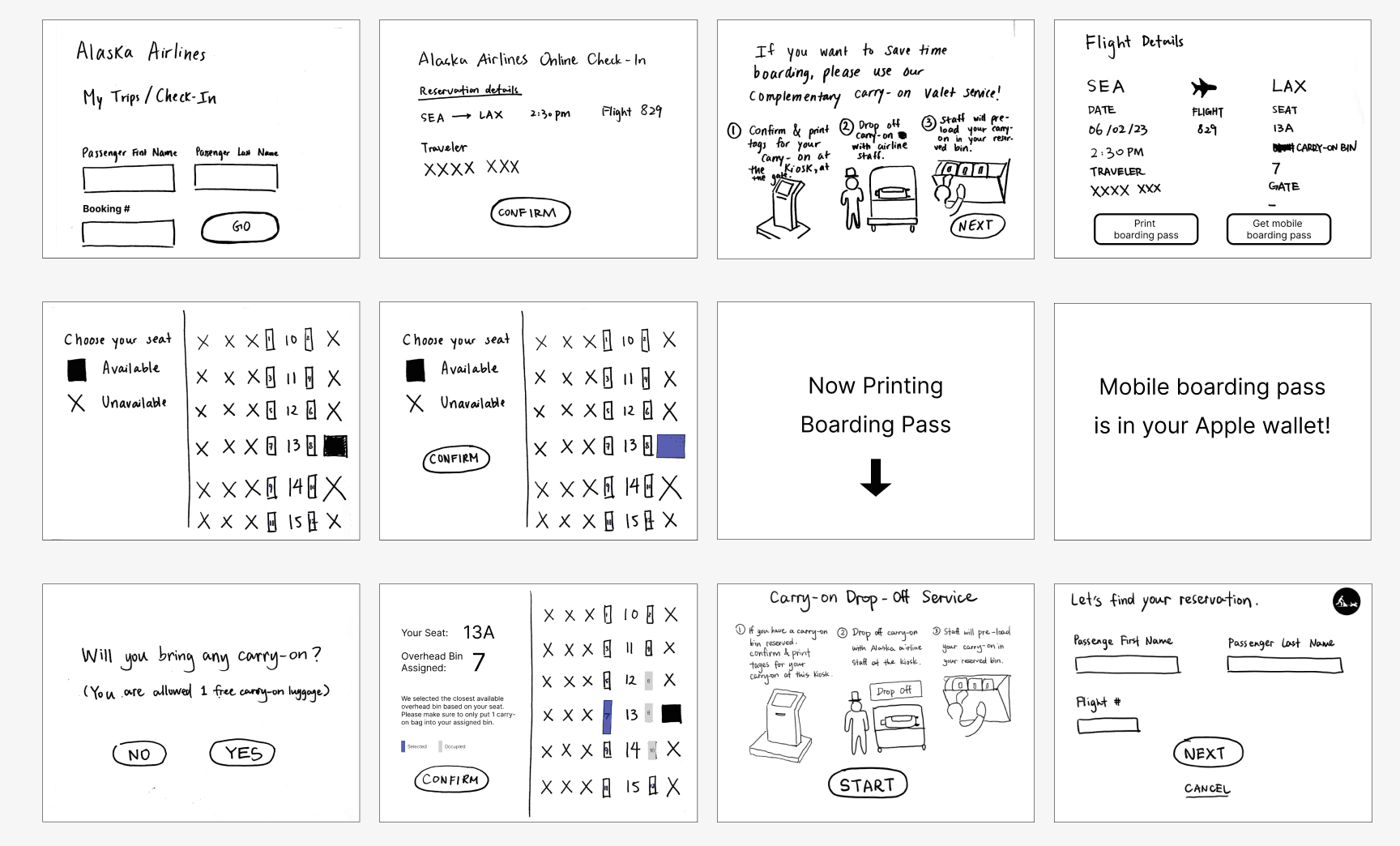
The sketches we created to test the carry-on reservation process
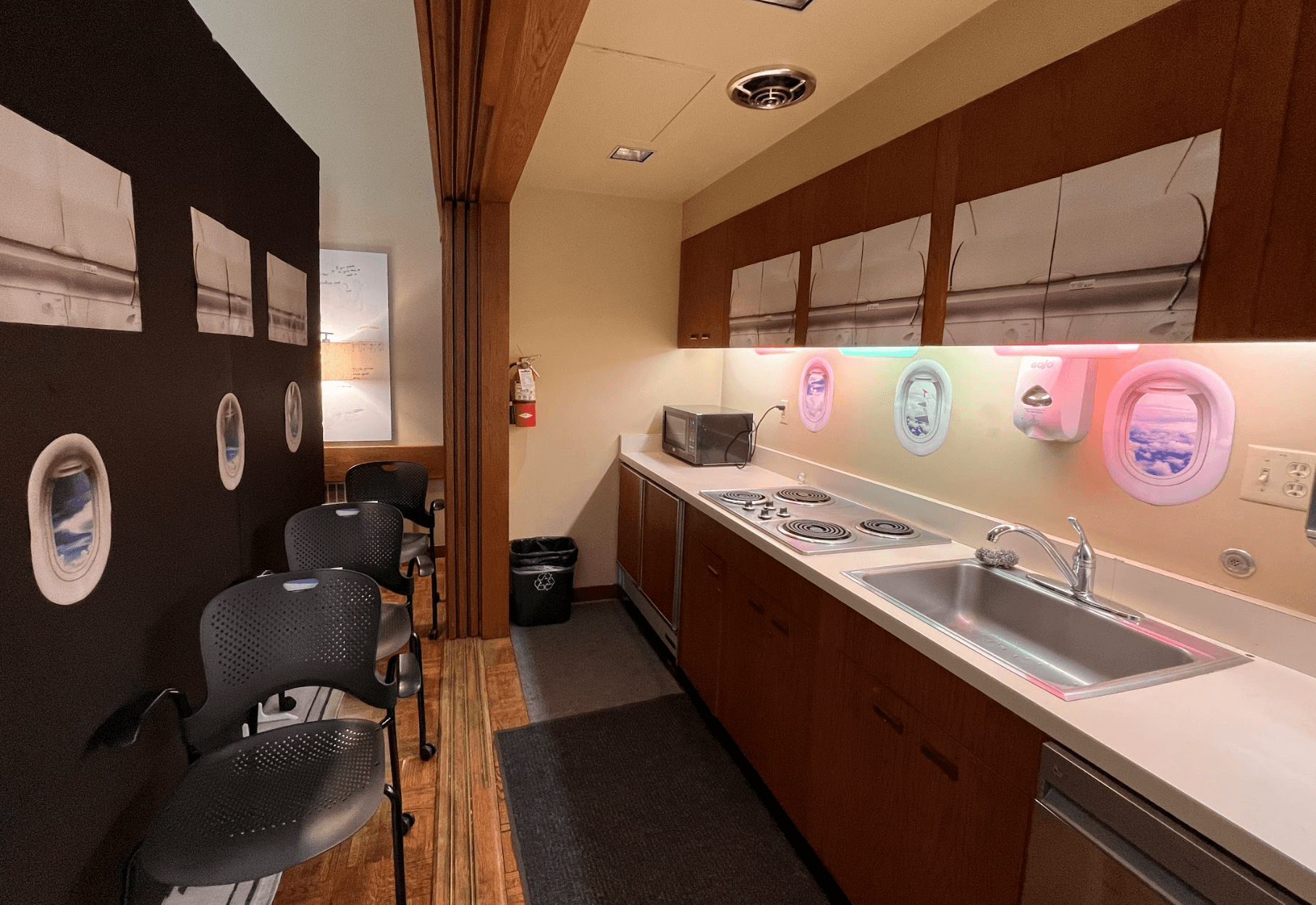
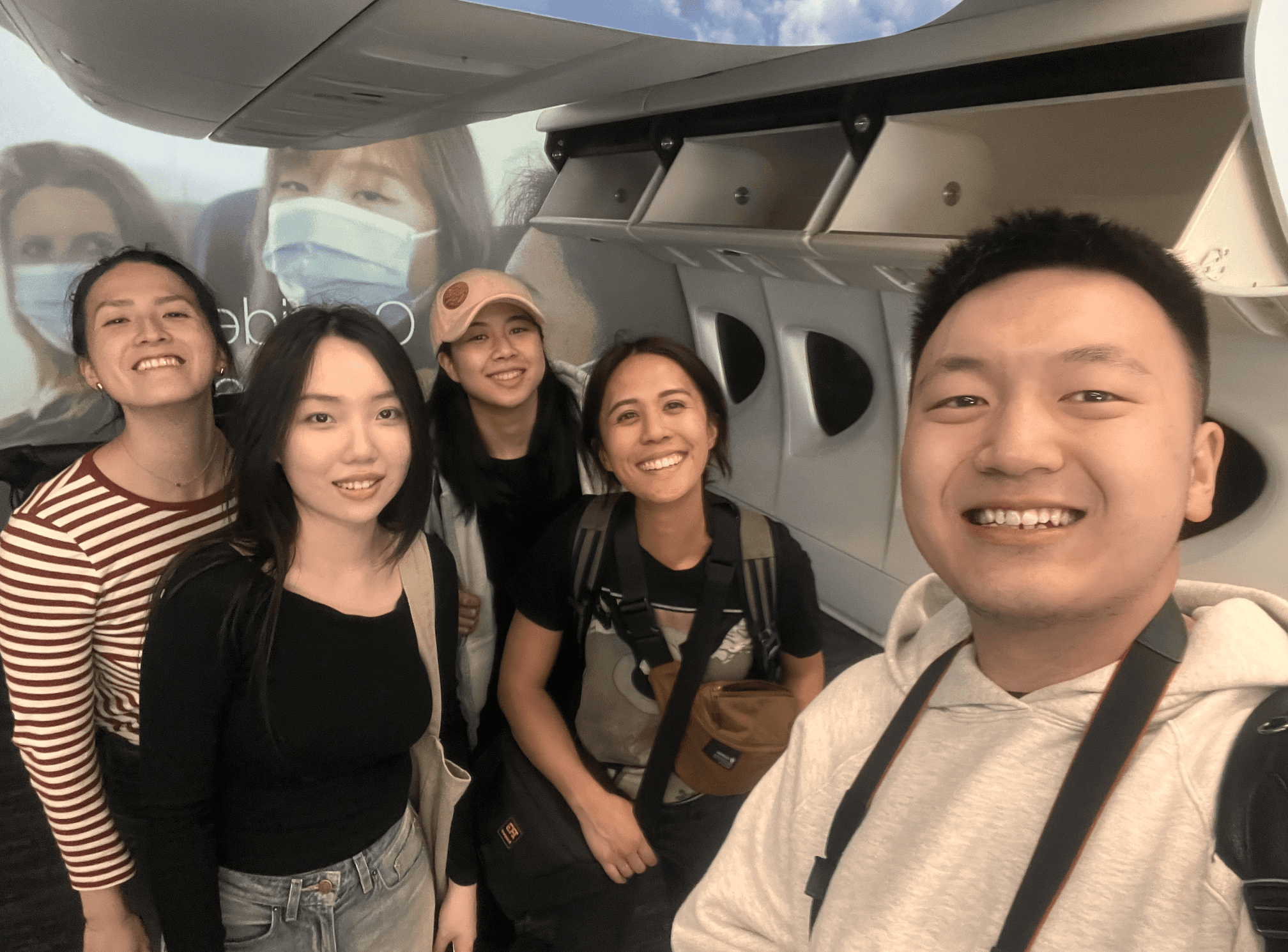
We built an airplane cabin to test how people board and if they understand the lights' colors underneath each overhead bin
USER TESTING
Collect user feedback for rapid concept evaluations
We conducted 4 user testing sessions to gather feedback and iterated our design accordingly. Throughout the process, I led all four testing sessions and interviews, as well as photographed and videotaped how users interacted with our prototype.
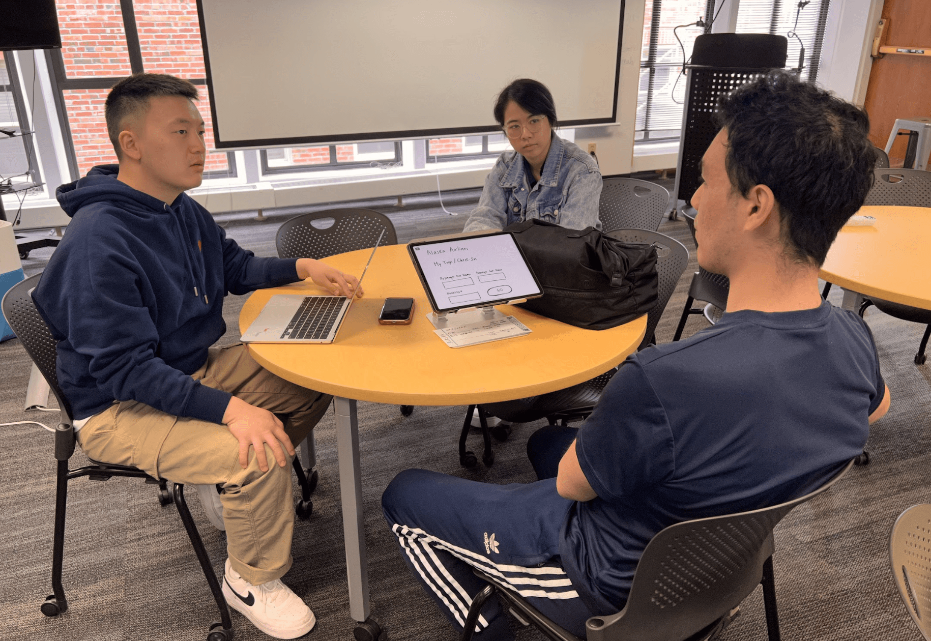
I moderated all of the testing sessions and conducted pre- and post-testing interviews
FINDINGS & ITERATIONS
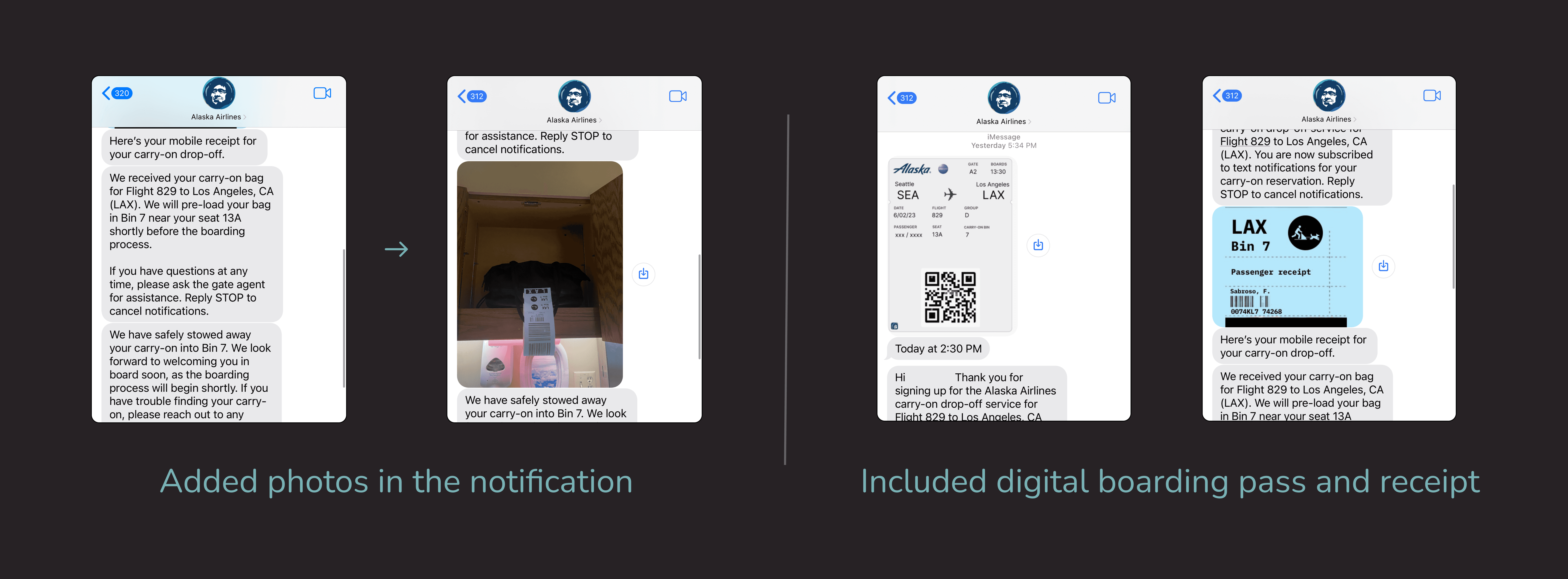
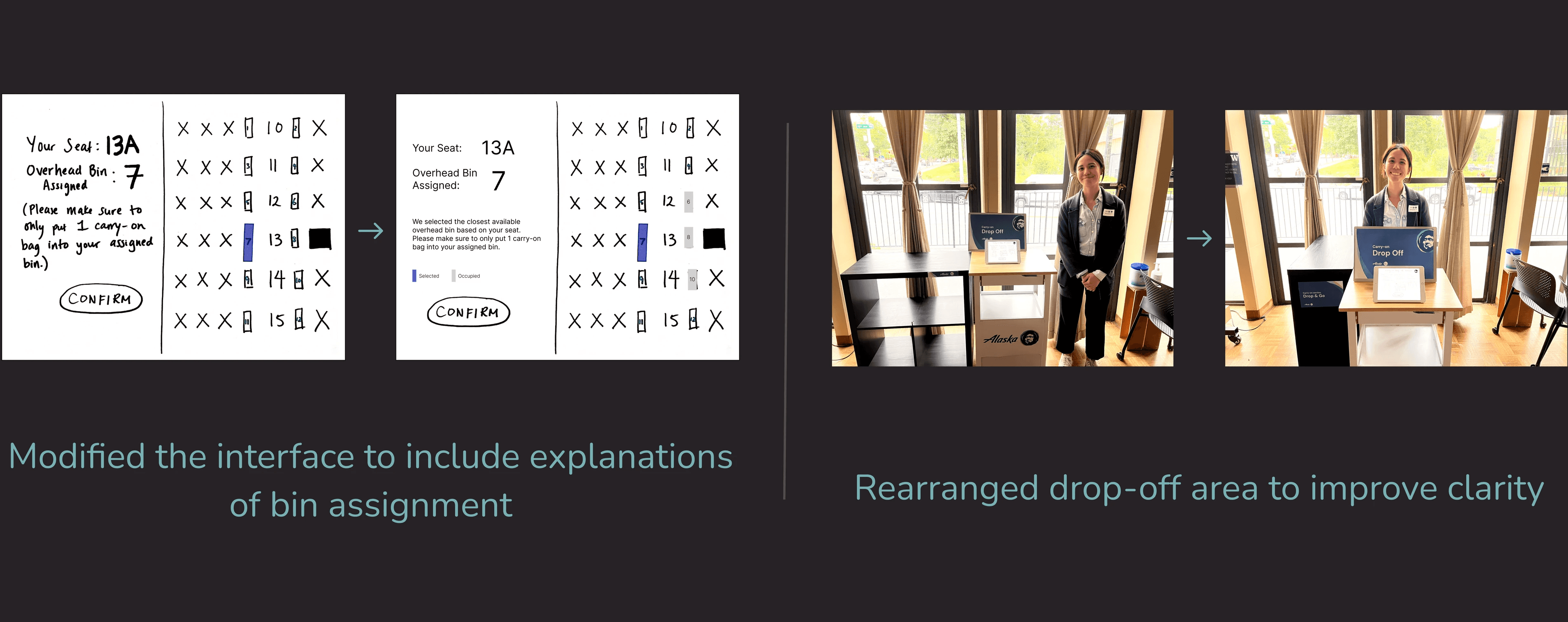
Consider digital components and iterate for better information experience
Added visual references and digital convenience
We added images in the notifications to increase certainty when the carry-on is loaded. We also included a simple and convenient digital alternative for managing physical items like printed boarding passes.
Iterated signage and instructions for improved information experience
We improved the interface design to clarify overhead bin assignments in order to reduce confusion. We also improved the arrangement of bag drop-off locations for greater clarity and revised signage design to eliminate ambiguity.
DESIGN IMPACT
A service that improves carry-on pre-boarding and provides passengers with peace of mind
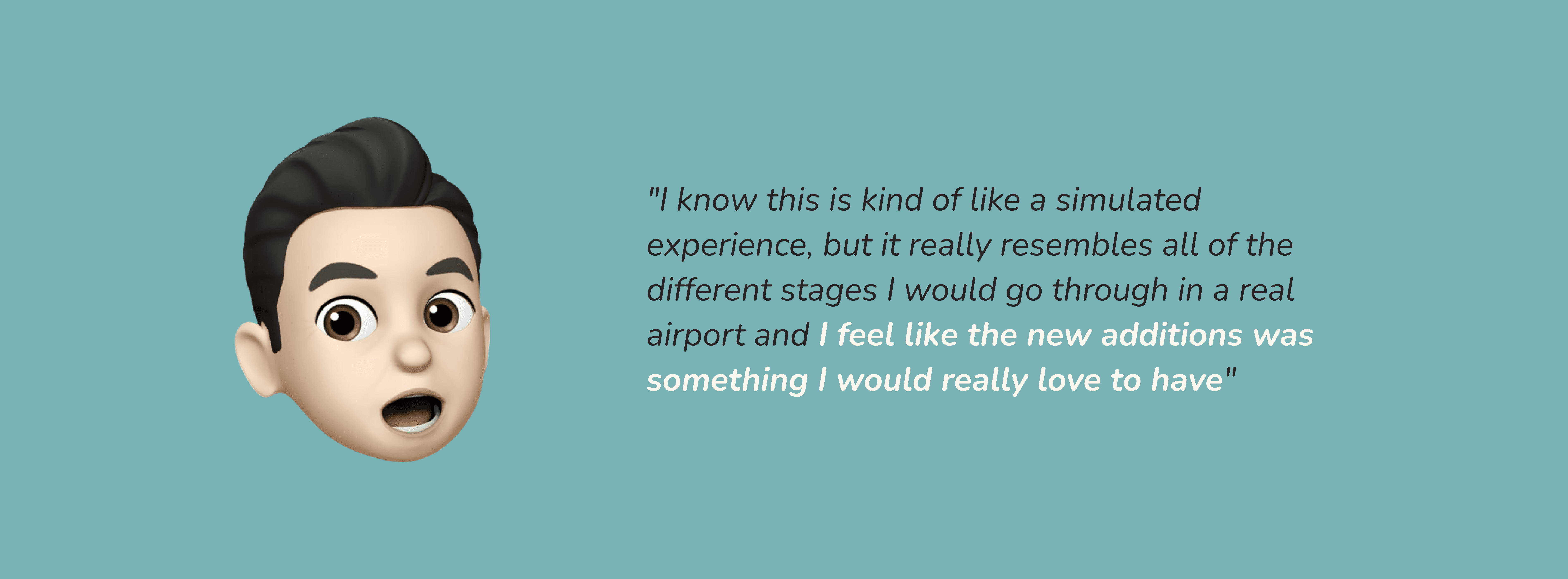
Our design received positive feedback from all participants during testing. In the future, our design could potentially reduce boarding lines by pre-loading carry-ons. While there are areas for improvement, all participants recognized the value of our service and expressed a desire to use it to improve their pre-boarding experience.
REFLECTIONS
A design approach that prioritizes experiences over technology
This project underscored the importance of context in creating complex subjective experiences. It reinforced that while technology aids the experience, the primary design goal always takes precedence.

Be ok with "good enough" and make quick decisions when needed
Rather than becoming overwhelmed and discussing multiple edge cases at once (as my team did during the project), it's better to concentrate on designing the "good enough" situation and noting those edge cases on a list so that we can address them later.

Acknowledge our assumptions and revisit our findings earlier
During one stage of the process, my team became overly focused on addressing information overload at the airport, which caused us to overlook other identified ideas. While we did consider information overload during the design phase, I wish we could revisit our findings earlier ensure we didn't missed anything critical to making informed decisions.

Consider edge cases if we had more time
If we had more time, I would consider some of those edge cases and iterate design in a case where user doesn't experience the ideal scenario.
ACKNOWLEDGEMENT
I'd like to thank all of my teammates, as well as the faculties for providing critical feedback that helped us move forward. I couldn't have done it without them <3.
Team Captcha (left to right): Emily Shu, Zoe Zuo, Carista Eliani, Veneza Yuzon, Larry Tian